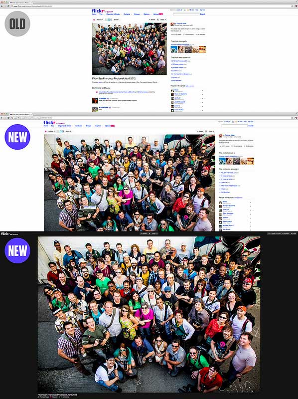
We’re releasing a new “liquid” layout.
Flickr’s “liquid” design adjusts the photo page and image size based on the size of your browser window. With that your photos will look great on a laptop screen, and look even more stunning on larger screens. With the new design:
- The biggest photo size is shown depending on your browser window
- There is absolutely no “upscaling”, and we try to avoid downsampling as much as possible.
- The title and the sidebar are visible without scrolling on landscape oriented photos. (which are the vast majority of photos on Flickr.)
via Flickr Blog
***
And, from Webmonkey:
Web developers, take note: Flickr’s new layout isn’t just eye-catching, it’s also somewhat responsively designed — adjusting to the myriad screens on the web today and displaying the best photo possible without clogging your tubes with huge photo downloads. Flickr does stop short of scaling pages down to phone-size screens — for which there is a separate mobile website — but it resizes nicely to handle tablets.
That’s right, Flickr is the latest (and perhaps the largest) website to embrace not just a mostly responsive design with a liquid layout and media queries, but also a responsive approach to images.
Are we seeing a new development in design, the – “take into account the iPad” ?
// Thx – Jon Jensen
