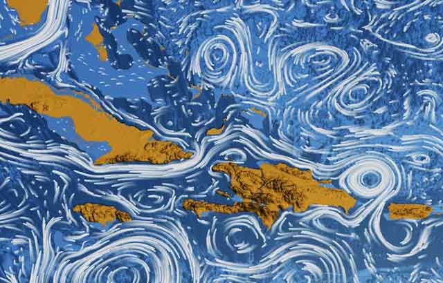
This visualization shows ocean surface currents around the world during the period from June 2005 through Decemeber 2007. The visualization does not include a narration or annotations; the goal was to use ocean flow data to create a simple, visceral experience.
This visualization was produced using NASA/JPL’s computational model called Estimating the Circulation and Climate of the Ocean, Phase II or ECCO2.
ECCO2 is high resolution model of the global ocean and sea-ice. ECCO2 attempts to model the oceans and sea ice to increasingly accurate resolutions that begin to resolve ocean eddies and other narrow-current systems which transport heat and carbon in the oceans.The ECCO2 model simulates ocean flows at all depths, but only surface flows are used in this visualization.
A full 20-minute version in HD is available at the Perpetual Motion NASA site.
Another writer ponders the similarities to Vincent Van Gogh’s Starry Night:
What you’re looking at is the surface current flow (not anything deeper) of oceans around the world, recorded from 2006 to 2007. The white lines are the currents, and the darker blue colors of the water represent bathymetry (the fancy word for misnomer “ocean topography”).
The image is wondrous, isn’t it? I had no conception of how many massive whirlpools sit off the world’s coasts. It’s hard to imagine how difficult sea travel must have been to early explorers, trapped in currents without motors, relying only on wind, guts, and the stars to take them somewhere they’ve never seen before. Heck, it seems scary to undertake now.
And all this pontification is ignoring just how unthinkingly beautiful the visualization looks.
via Co.Design
