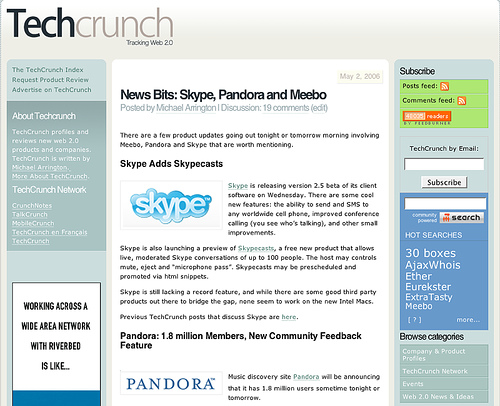
This week TechCrunch launched a new design for their site and Michael Arrington, the founder, posted links to the previous designs. Which gives us a unique chance to see the evolution of blog design from 2005 to 2011.
Screenshots of all four changes are provided below and here are the big changes I noticed, what did you see?
- Ads – most dramatic change, in number (1 ⇒ 8 ⇒ 10 ⇒ 1) and size (wide banner is gone).
- Admin links – like categories, search, about, have steadily moved up the site, now resting on the very top.
- RSS – went from prominent placement to completely missing.
- Content – hasn’t changed, except for picture on left and title font growth.
- Sidebar – the eternal experimental space with the site going from sidebars at dual surround, dual right, thinner dual right, and single right.
*TechCrunch runs on WordPress*
2011
—
2008
—
2006
—
2005
—
Photo credits
2011 – my screenshot
2008 – Digital Inspiration
2006 – CrunchNotes
2005 – Michael Arrington on Flickr


I just love how the article page today has already changed from the posting of this blog post. Now with a 728×90 leaderboard ad and social share.
A comment from Google+ — Chris Krahe – See http://wayback.archive.org/web/*/http://WWW.techcrunch.com for the whole site history